| 前のトピックへ :: 次のトピックへ |
| 作成者 |
メッセージ |
alaios 

登録日: 2014年1月24日
投稿: 724
|
 投稿日時: 火 10月 21, 2014 6:32 pm 件名: Does this work for you? |
|
投稿日時: 火 10月 21, 2014 6:32 pm 件名: Does this work for you? |
|
|
alaios wrote:
what do you think?

Regards
Alex |
|
| トップへ戻る |
|
 |
inombrable

登録日: 2012年3月20日
投稿: 545
所在地: Salamanca, Mexico
|
投稿日時: 火 10月 21, 2014 8:02 pm 件名: |
|
投稿日時: 火 10月 21, 2014 8:02 pm 件名: |
|
|
inombrable wrote:
To me looks like movie poster,
Interesting !! |
|
| トップへ戻る |
|
|
kansalliskala


登録日: 2007年7月19日
投稿: 5122
所在地: Southern Finland countryside
Expire: 2016-12-30
|
投稿日時: 火 10月 21, 2014 8:31 pm 件名: |
|
投稿日時: 火 10月 21, 2014 8:31 pm 件名: |
|
|
kansalliskala wrote:
good result
nice noire feeling
_________________
MF: Kodak DCS SLR/c; Samsung NX10; OM-10; Canon T50
Zuiko 28/3.5, Distagon 35/2.8; Yashica ML 50/2;
Zuiko 50/1.4; S-M-C 120/2.8; Zuiko 135/3.5; 200/5;
Tamron AD1 135/2.8, Soligor 180/3.5; Tamron AD1 300/5.6
Tamron zooms: 01A, Z-210
Yashicaflex C; Київ 4 + Юпитер 8, 11; Polaroid 100; Olympus XA; Yashica T3
Museum stuff: Certo-Phot; Tele-Edixon 135; Polaris 90-190; Asahi Bellows; Ixus IIs
Projects: Agfa Isolette III (no shutter), Canon AE-1D (no sensor),
Nikon D80 (dead), The "Peace Camera"
AF: Canon, Tokina, Sigma Video: JVC GZ-MG275E |
|
| トップへ戻る |
|
|
philslizzy

登録日: 2012年8月7日
投稿: 4753
所在地: Cheshire, England
|
投稿日時: 火 10月 21, 2014 10:39 pm 件名: |
|
投稿日時: 火 10月 21, 2014 10:39 pm 件名: |
|
|
philslizzy wrote:
I can see what the other guys are referring to but for me its a blurry photo of a car in the rain.
_________________
Hero in the 'messin-with-cameras-for-the-hell-of-it department'. Official. |
|
| トップへ戻る |
|
|
ZoneV
登録日: 2009年11月9日
投稿: 1633
所在地: Germany
Expire: 2011-12-02
|
投稿日時: 水 10月 22, 2014 7:56 am 件名: |
|
投稿日時: 水 10月 22, 2014 7:56 am 件名: |
|
|
ZoneV wrote:
I like it much, the feeling of movement, night and rain.
_________________
Camera modification, repair and DIY - some links to look through: http://www.4photos.de/camera-diy/index-en.html
I AM A LENS NERD!
Epis, Elmaron, Emerald, Ernostar, Helioplan and Heidosmat.
Epiotar, Kameraobjektiv, Anastigmat, Epis, Meganast, Magnagon, Quinar, Culmigon, Novotrinast, Novflexar, Colorplan, Sekor, Kinon, Talon, Telemegor, Xenon, Xenar, Ultra, Ultra Star. Tessar, Janar, Visionar, Kiptar, Kipronar and Rotelar.
|
|
| トップへ戻る |
|
|
alaios
登録日: 2014年1月24日
投稿: 724
|
投稿日時: 水 10月 22, 2014 9:27 am 件名: |
|
投稿日時: 水 10月 22, 2014 9:27 am 件名: |
|
|
alaios wrote:
Thanks for the feedback...I would like to stay more at phills answer... I am struggling find out what is good or not (one more post with example will follow the next days)
I am trying to understand what makes an intresting composition or not.... How one has to work to find that... what are the mistakes that has to correct... and even more importantly who is the master that has to trust...
It feels so alone this field |
|
| トップへ戻る |
|
|
kansalliskala
登録日: 2007年7月19日
投稿: 5122
所在地: Southern Finland countryside
Expire: 2016-12-30
|
投稿日時: 水 10月 22, 2014 9:30 am 件名: |
|
投稿日時: 水 10月 22, 2014 9:30 am 件名: |
|
|
kansalliskala wrote:
| alaios 氏の書き込み: |
Thanks for the feedback...I would like to stay more at phills answer... I am struggling find out what is good or not (one more post with example will follow the next days)
I am trying to understand what makes an intresting composition or not.... How one has to work to find that... what are the mistakes that has to correct... and even more importantly who is the master that has to trust...
It feels so alone this field |
Have you tried shooting video, it's very refreshing and you get new angles to stills too.
_________________
MF: Kodak DCS SLR/c; Samsung NX10; OM-10; Canon T50
Zuiko 28/3.5, Distagon 35/2.8; Yashica ML 50/2;
Zuiko 50/1.4; S-M-C 120/2.8; Zuiko 135/3.5; 200/5;
Tamron AD1 135/2.8, Soligor 180/3.5; Tamron AD1 300/5.6
Tamron zooms: 01A, Z-210
Yashicaflex C; Київ 4 + Юпитер 8, 11; Polaroid 100; Olympus XA; Yashica T3
Museum stuff: Certo-Phot; Tele-Edixon 135; Polaris 90-190; Asahi Bellows; Ixus IIs
Projects: Agfa Isolette III (no shutter), Canon AE-1D (no sensor),
Nikon D80 (dead), The "Peace Camera"
AF: Canon, Tokina, Sigma Video: JVC GZ-MG275E |
|
| トップへ戻る |
|
|
alaios
登録日: 2014年1月24日
投稿: 724
|
投稿日時: 水 10月 22, 2014 4:30 pm 件名: |
|
投稿日時: 水 10月 22, 2014 4:30 pm 件名: |
|
|
alaios wrote:
Let me continue the discussion further before I introduce a new topic (that would be in somehow different topic)
Does this work for you?

Alex |
|
| トップへ戻る |
|
|
kansalliskala
登録日: 2007年7月19日
投稿: 5122
所在地: Southern Finland countryside
Expire: 2016-12-30
|
投稿日時: 水 10月 22, 2014 6:17 pm 件名: |
|
投稿日時: 水 10月 22, 2014 6:17 pm 件名: |
|
|
kansalliskala wrote:
scary 
that's the sequel for the first movie?
"killer car in the night part II"
_________________
MF: Kodak DCS SLR/c; Samsung NX10; OM-10; Canon T50
Zuiko 28/3.5, Distagon 35/2.8; Yashica ML 50/2;
Zuiko 50/1.4; S-M-C 120/2.8; Zuiko 135/3.5; 200/5;
Tamron AD1 135/2.8, Soligor 180/3.5; Tamron AD1 300/5.6
Tamron zooms: 01A, Z-210
Yashicaflex C; Київ 4 + Юпитер 8, 11; Polaroid 100; Olympus XA; Yashica T3
Museum stuff: Certo-Phot; Tele-Edixon 135; Polaris 90-190; Asahi Bellows; Ixus IIs
Projects: Agfa Isolette III (no shutter), Canon AE-1D (no sensor),
Nikon D80 (dead), The "Peace Camera"
AF: Canon, Tokina, Sigma Video: JVC GZ-MG275E |
|
| トップへ戻る |
|
|
philslizzy
登録日: 2012年8月7日
投稿: 4753
所在地: Cheshire, England
|
投稿日時: 水 10月 22, 2014 11:27 pm 件名: |
|
投稿日時: 水 10月 22, 2014 11:27 pm 件名: |
|
|
philslizzy wrote:
Now that is interesting. Nicely composed with good, strong contrast. Dramatic. Quite what it's saying is beyond me... but art is like that, you create something that pleases you, in your mind you justify it and there is a reason for it. Other people sometimes just don't 'get' it. I don't get this but Its a good powerful image anyway. Well done.
_________________
Hero in the 'messin-with-cameras-for-the-hell-of-it department'. Official. |
|
| トップへ戻る |
|
|
alaios
登録日: 2014年1月24日
投稿: 724
|
投稿日時: 木 10月 23, 2014 6:32 pm 件名: |
|
投稿日時: 木 10月 23, 2014 6:32 pm 件名: |
|
|
alaios wrote:
Thanks for the answers... How about those two then?
I am not playing any games.. I am trying to see inside your brains 
At the end is a very intresting game

 |
|
| トップへ戻る |
|
|
philslizzy
登録日: 2012年8月7日
投稿: 4753
所在地: Cheshire, England
|
投稿日時: 木 10月 23, 2014 10:43 pm 件名: |
|
投稿日時: 木 10月 23, 2014 10:43 pm 件名: |
|
|
philslizzy wrote:
The crop and the processing makes a good image, the others , specially the colour one are ho-hum and dont have the impact.
_________________
Hero in the 'messin-with-cameras-for-the-hell-of-it department'. Official. |
|
| トップへ戻る |
|
|
kansalliskala
登録日: 2007年7月19日
投稿: 5122
所在地: Southern Finland countryside
Expire: 2016-12-30
|
投稿日時: 金 10月 24, 2014 7:37 pm 件名: |
|
投稿日時: 金 10月 24, 2014 7:37 pm 件名: |
|
|
kansalliskala wrote:
| alaios 氏の書き込み: |
I am trying to see inside your brains
|
no - you are a Zombie? 
_________________
MF: Kodak DCS SLR/c; Samsung NX10; OM-10; Canon T50
Zuiko 28/3.5, Distagon 35/2.8; Yashica ML 50/2;
Zuiko 50/1.4; S-M-C 120/2.8; Zuiko 135/3.5; 200/5;
Tamron AD1 135/2.8, Soligor 180/3.5; Tamron AD1 300/5.6
Tamron zooms: 01A, Z-210
Yashicaflex C; Київ 4 + Юпитер 8, 11; Polaroid 100; Olympus XA; Yashica T3
Museum stuff: Certo-Phot; Tele-Edixon 135; Polaris 90-190; Asahi Bellows; Ixus IIs
Projects: Agfa Isolette III (no shutter), Canon AE-1D (no sensor),
Nikon D80 (dead), The "Peace Camera"
AF: Canon, Tokina, Sigma Video: JVC GZ-MG275E |
|
| トップへ戻る |
|
|
alaios
登録日: 2014年1月24日
投稿: 724
|
投稿日時: 土 10月 25, 2014 8:09 pm 件名: |
|
投稿日時: 土 10月 25, 2014 8:09 pm 件名: |
|
|
alaios wrote:
Thanks for still answering.
Lets take now the close crop to the hand that kind of you guys liked... I am trying to understand when we need more information about the background... as I find that this shot does not reveal where it was taken...
The full versions I posted just afterwards show that this is a train and it was perhaps rather empty as two seats behind were empty.
How much of the background we need to give side information and how much we can crop it out by reserving this time of information?
I tried several croppings but I do not really get this relation.
More samples of other thinks I have tried would follow
Alex |
|
| トップへ戻る |
|
|
kansalliskala
登録日: 2007年7月19日
投稿: 5122
所在地: Southern Finland countryside
Expire: 2016-12-30
|
投稿日時: 土 10月 25, 2014 8:14 pm 件名: |
|
投稿日時: 土 10月 25, 2014 8:14 pm 件名: |
|
|
kansalliskala wrote:
the hand looks cut off
_________________
MF: Kodak DCS SLR/c; Samsung NX10; OM-10; Canon T50
Zuiko 28/3.5, Distagon 35/2.8; Yashica ML 50/2;
Zuiko 50/1.4; S-M-C 120/2.8; Zuiko 135/3.5; 200/5;
Tamron AD1 135/2.8, Soligor 180/3.5; Tamron AD1 300/5.6
Tamron zooms: 01A, Z-210
Yashicaflex C; Київ 4 + Юпитер 8, 11; Polaroid 100; Olympus XA; Yashica T3
Museum stuff: Certo-Phot; Tele-Edixon 135; Polaris 90-190; Asahi Bellows; Ixus IIs
Projects: Agfa Isolette III (no shutter), Canon AE-1D (no sensor),
Nikon D80 (dead), The "Peace Camera"
AF: Canon, Tokina, Sigma Video: JVC GZ-MG275E |
|
| トップへ戻る |
|
|
philslizzy
登録日: 2012年8月7日
投稿: 4753
所在地: Cheshire, England
|
投稿日時: 土 10月 25, 2014 8:37 pm 件名: |
|
投稿日時: 土 10月 25, 2014 8:37 pm 件名: |
|
|
philslizzy wrote:
| alaios 氏の書き込み: |
Thanks for still answering.
Lets take now the close crop to the hand that kind of you guys liked... I am trying to understand when we need more information about the background... as I find that this shot does not reveal where it was taken...
The full versions I posted just afterwards show that this is a train and it was perhaps rather empty as two seats behind were empty.
How much of the background we need to give side information and how much we can crop it out by reserving this time of information?
I tried several croppings but I do not really get this relation.
More samples of other thinks I have tried would follow
Alex |
Do we need to know where it is? I think the disembodied hand works fine, revealing more background would distract the viewer. The crop was almost perfect. I think from your comments you are not 100% certain exactly what you are doing. That's not a bad thing, you ask for opinions and almost all are positive. Accept the positives and don't question yourself, you must be doing something right! More please!!
_________________
Hero in the 'messin-with-cameras-for-the-hell-of-it department'. Official. |
|
| トップへ戻る |
|
|
alaios
登録日: 2014年1月24日
投稿: 724
|
投稿日時: 日 10月 26, 2014 2:14 pm 件名: |
|
投稿日時: 日 10月 26, 2014 2:14 pm 件名: |
|
|
alaios wrote:
thanks.
do you mean that in the first version the hand looks like it was cut from the body. right?
Alex |
|
| トップへ戻る |
|
|
philslizzy
登録日: 2012年8月7日
投稿: 4753
所在地: Cheshire, England
|
投稿日時: 日 10月 26, 2014 3:32 pm 件名: |
|
投稿日時: 日 10月 26, 2014 3:32 pm 件名: |
|
|
philslizzy wrote:
No not cut from, but separated from as it appears to be on its own in the image with no visible arm or person behind it. We know its attached to someone we can't see.
_________________
Hero in the 'messin-with-cameras-for-the-hell-of-it department'. Official. |
|
| トップへ戻る |
|
|
alaios
登録日: 2014年1月24日
投稿: 724
|
投稿日時: 日 10月 26, 2014 8:15 pm 件名: |
|
投稿日時: 日 10月 26, 2014 8:15 pm 件名: |
|
|
alaios wrote:
thanks guys. Tomorrow I move to question number two.
Alex |
|
| トップへ戻る |
|
|
alaios
登録日: 2014年1月24日
投稿: 724
|
投稿日時: 水 11月 05, 2014 8:27 pm 件名: |
|
投稿日時: 水 11月 05, 2014 8:27 pm 件名: |
|
|
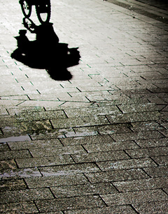
alaios wrote:
I am sorry I have not replied earlier.. but life gets easily complicated. I am moving forward. Does this work for you?
 |
|
| トップへ戻る |
|
|
philslizzy
登録日: 2012年8月7日
投稿: 4753
所在地: Cheshire, England
|
投稿日時: 木 11月 06, 2014 4:34 pm 件名: |
|
投稿日時: 木 11月 06, 2014 4:34 pm 件名: |
|
|
philslizzy wrote:
The bike should be either in the frame completely or out of it completely in my opinion. as it is its cut off.
However it is an interesting image, you use light, shade and black and white to good effect. You have an imaginative eye.
edit: (leaving my original comment as it is rather than changing it) The more you look at it the better it seems. The composition is non-standard, I would have tried to use the rule of thirds but the way you did it has a pleasing effect.
my version with the rule of thirds applied, not as powerful as yours.

_________________
Hero in the 'messin-with-cameras-for-the-hell-of-it department'. Official. |
|
| トップへ戻る |
|
|
alaios
登録日: 2014年1月24日
投稿: 724
|
投稿日時: 火 11月 18, 2014 7:38 pm 件名: |
|
投稿日時: 火 11月 18, 2014 7:38 pm 件名: |
|
|
alaios wrote:
Hi thanks for the reply... sorry for the late reply but I try to not forget photography
that would be my latest version

which I think I would keep
Regards
A |
|
| トップへ戻る |
|
|
kansalliskala
登録日: 2007年7月19日
投稿: 5122
所在地: Southern Finland countryside
Expire: 2016-12-30
|
投稿日時: 火 11月 18, 2014 7:48 pm 件名: |
|
投稿日時: 火 11月 18, 2014 7:48 pm 件名: |
|
|
kansalliskala wrote:
I really like the last one!
_________________
MF: Kodak DCS SLR/c; Samsung NX10; OM-10; Canon T50
Zuiko 28/3.5, Distagon 35/2.8; Yashica ML 50/2;
Zuiko 50/1.4; S-M-C 120/2.8; Zuiko 135/3.5; 200/5;
Tamron AD1 135/2.8, Soligor 180/3.5; Tamron AD1 300/5.6
Tamron zooms: 01A, Z-210
Yashicaflex C; Київ 4 + Юпитер 8, 11; Polaroid 100; Olympus XA; Yashica T3
Museum stuff: Certo-Phot; Tele-Edixon 135; Polaris 90-190; Asahi Bellows; Ixus IIs
Projects: Agfa Isolette III (no shutter), Canon AE-1D (no sensor),
Nikon D80 (dead), The "Peace Camera"
AF: Canon, Tokina, Sigma Video: JVC GZ-MG275E |
|
| トップへ戻る |
|
|
alaios
登録日: 2014年1月24日
投稿: 724
|
投稿日時: 火 11月 18, 2014 8:57 pm 件名: |
|
投稿日時: 火 11月 18, 2014 8:57 pm 件名: |
|
|
alaios wrote:
thanks for feedback. Lets allow more users to comment and then I will proceed with my next shot |
|
| トップへ戻る |
|
|
alaios
登録日: 2014年1月24日
投稿: 724
|
投稿日時: 水 11月 19, 2014 7:07 pm 件名: |
|
投稿日時: 水 11月 19, 2014 7:07 pm 件名: |
|
|
alaios wrote:
Moving forward with the title "Loneliness"
Does this work for you?
 |
|
| トップへ戻る |
|
|
|
|
 日本語
 Español
 中文
 Magyar
 Русский
 Deutsch
 Français