| 前のトピックへ :: 次のトピックへ |
| 作成者 |
メッセージ |
Himself 

登録日: 2007年3月1日
投稿: 3315
所在地: Montreal
Expire: 2013-05-30
|
 投稿日時: 火 1月 31, 2023 12:15 am 件名: Gerbera |
|
投稿日時: 火 1月 31, 2023 12:15 am 件名: Gerbera |
|
|
Himself wrote:
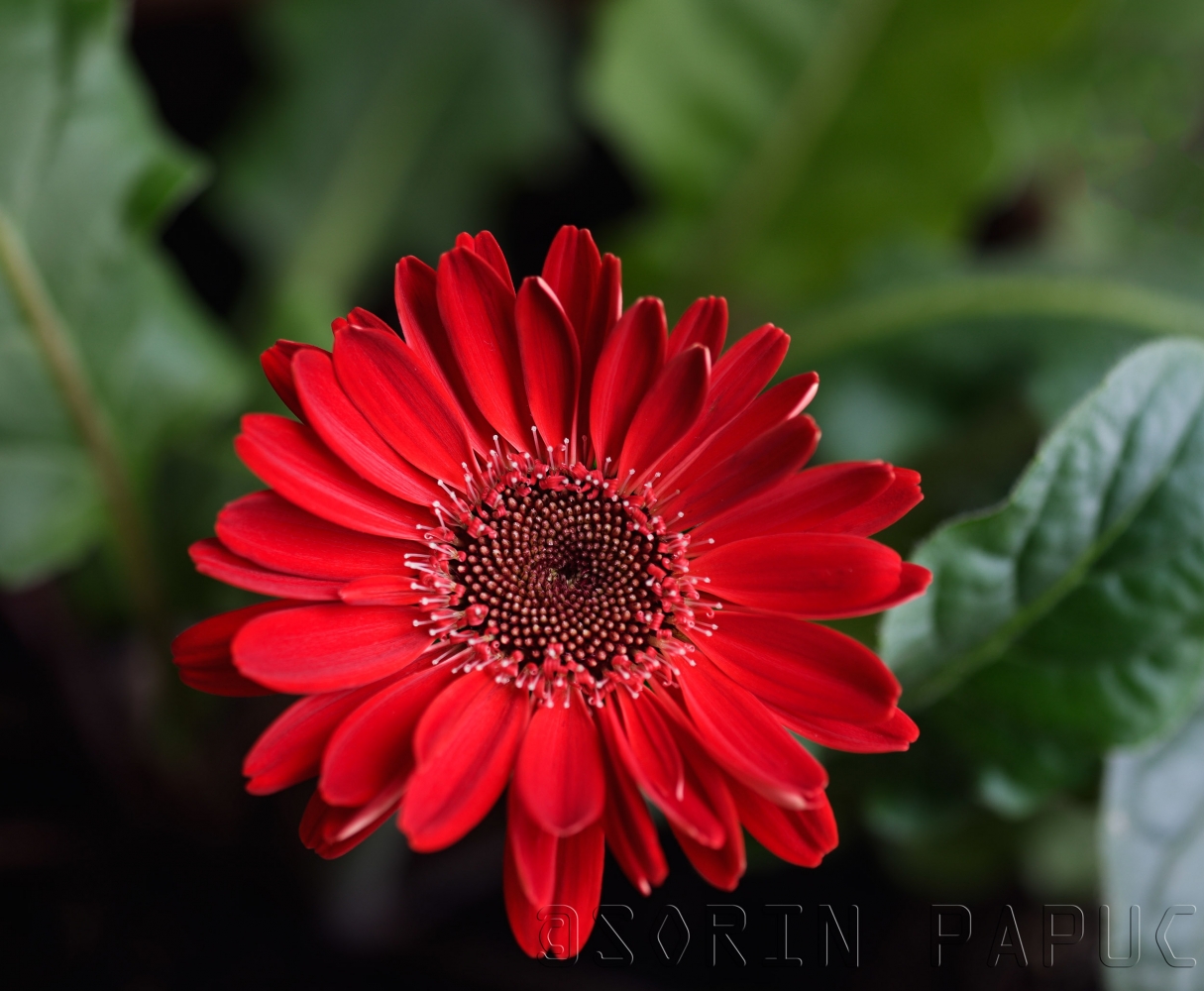
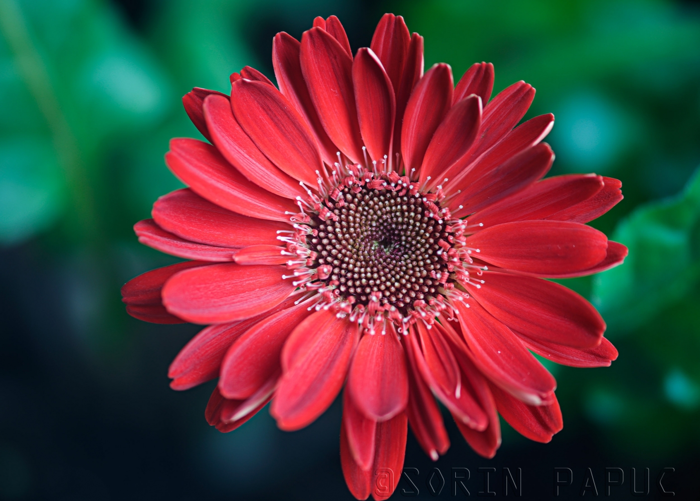
First one is Mamiya 120/4 at f/4 and second one is Canon FD 200/4 at f/4.
Different red rendition.
Minimal PP.
_________________
Moderator Himself |
|
| トップへ戻る |
|
 |
jamaeolus

登録日: 2014年3月19日
投稿: 3202
所在地: Eugene
Expire: 2015-08-20
|
投稿日時: 火 1月 31, 2023 5:51 am 件名: |
|
投稿日時: 火 1月 31, 2023 5:51 am 件名: |
|
|
jamaeolus wrote:
 very nice!
_________________
photos are moments frozen in time |
|
| トップへ戻る |
|
|
alex ph

登録日: 2013年3月16日
投稿: 1802
|
投稿日時: 水 2月 01, 2023 4:43 pm 件名: |
|
投稿日時: 水 2月 01, 2023 4:43 pm 件名: |
|
|
alex ph wrote:
Your comparison demonstrates clearly that Mamiya slightly oversaturates reds while Canon adds some blue/magenta (seen especially well in the background green of the leaves). Do you consider it to be the glass itself or the way each lens directs the AW of the camera? |
|
| トップへ戻る |
|
|
jamaeolus
登録日: 2014年3月19日
投稿: 3202
所在地: Eugene
Expire: 2015-08-20
|
投稿日時: 木 2月 02, 2023 1:20 am 件名: |
|
投稿日時: 木 2月 02, 2023 1:20 am 件名: |
|
|
jamaeolus wrote:
Red is a challenging color to render well. I find that many many lenses do a poor job of displaying the brilliant red colors of some of the rhododendron flowers in my yard.
_________________
photos are moments frozen in time |
|
| トップへ戻る |
|
|
Doc Sharptail

登録日: 2020年11月23日
投稿: 1504
所在地: Winnipeg Canada
|
投稿日時: 木 2月 02, 2023 2:20 am 件名: |
|
投稿日時: 木 2月 02, 2023 2:20 am 件名: |
|
|
Doc Sharptail wrote:
| jamaeolus 氏の書き込み: |
| Red is a challenging color to render well. I find that many many lenses do a poor job of displaying the brilliant red colors of some of the rhododendron flowers in my yard. |
I agree with part of the above- especially where strong cross lighting is involved.
I have had faint pink wilted store bought roses render semi-dark lipstick red. Undiffused direct flash will do the same thing with some lenses.
Some of my older single coated lenses fall into the above category.
While the images may not have technically "correct" color rendering, the images can still be useful and pleasing.
It all depends on what is wanted out of the final image.
As for Canon glass having a different rendering, yes it does.
That is by no means a put-down of Canon glass- far from it.
Some of the imagery made on film with the FD era lenses is absolutely beautiful, at least in my experience.
When it comes to color accuracy of flowers, I've found moderate back-lighting to be a bit of an advantage, especially with older glass.
I hope to find out more on this in the coming spring when the flower boxes and planters come back out.
-D.S.
_________________
D-810, F2, FTN, FT-3 in Black
35mm f2 O.C. nikkor
50 f2 H nikkor, 50 f2 H.C. nikkor, 50 f 1.4 AI-s, 135 f3.5 Q,
50 f2 K nikkor 2x, 28-85mm f3.5-4.5 A/I-s, 35-105 3.5-4.5 A/I-s, 200mm f4 Micro A/I, partial list.
"Ain't no half-way" -S.R.V.
"Oh Yeah... Alright" -Paul Simon |
|
| トップへ戻る |
|
|
Himself
登録日: 2007年3月1日
投稿: 3315
所在地: Montreal
Expire: 2013-05-30
|
投稿日時: 木 2月 02, 2023 1:31 pm 件名: |
|
投稿日時: 木 2月 02, 2023 1:31 pm 件名: |
|
|
Himself wrote:
| alex ph 氏の書き込み: |
| Your comparison demonstrates clearly that Mamiya slightly oversaturates reds while Canon adds some blue/magenta (seen especially well in the background green of the leaves). Do you consider it to be the glass itself or the way each lens directs the AW of the camera? |
I just said that is a different red rendition.
Mamiya is the closest to the actual color of the flower.
As for the blue/magenta tinge? It might be the polarizing filter???
Both lenses had polarizing filters: Mamiya - Hoya, Canon - B+W
I've always considered Mamiya having the closest to reality red rendintion when I did these kind of non accurate  comparisons.
And to quote jamaeolus red is a chalanging color to render properly and in my experience the most prone to burn.
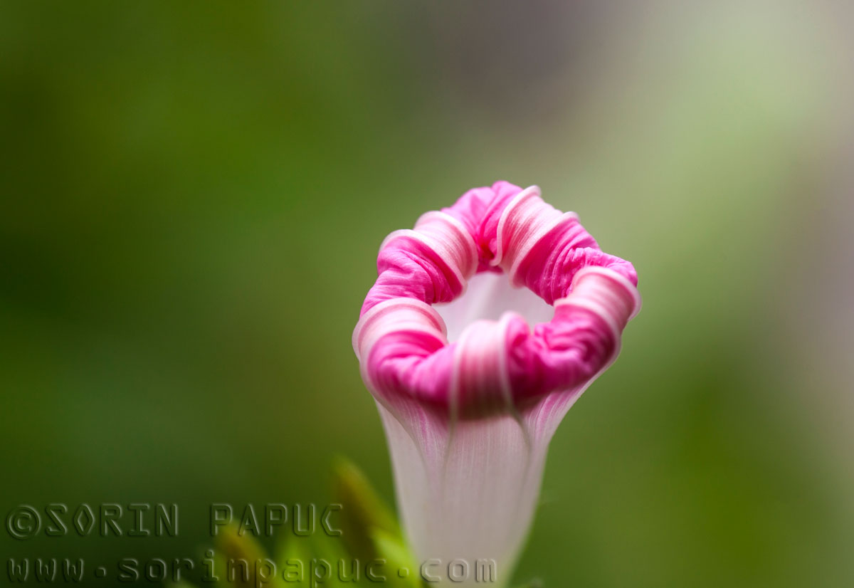
Here is another Mamiya that is spot on with the colors:
Morning glory
_________________
Moderator Himself |
|
| トップへ戻る |
|
|
papasito
登録日: 2015年1月9日
投稿: 1721
|
投稿日時: 木 2月 02, 2023 4:30 pm 件名: |
|
投稿日時: 木 2月 02, 2023 4:30 pm 件名: |
|
|
papasito wrote:
Mamiya rendering is something warmish, like almost all my mamiya lenses for 35 mm.
My 55/1,8, 35/2,8, 135/2,8 and 85/2 8 (all SX) have warm rendering. |
|
| トップへ戻る |
|
|
KEO
登録日: 2018年9月27日
投稿: 813
所在地: USA
|
投稿日時: 木 2月 02, 2023 6:45 pm 件名: |
|
投稿日時: 木 2月 02, 2023 6:45 pm 件名: |
|
|
KEO wrote:
I always find it helpful to remember than many flowers - especially red and orange ones - are reflecting light far beyond the spectrum visible to the human eye. |
|
| トップへ戻る |
|
|
stevemark
登録日: 2011年4月29日
投稿: 5509
所在地: Switzerland
|
投稿日時: 木 2月 02, 2023 7:35 pm 件名: |
|
投稿日時: 木 2月 02, 2023 7:35 pm 件名: |
|
|
stevemark wrote:
| jamaeolus 氏の書き込み: |
| Red is a challenging color to render well. I find that many many lenses do a poor job of displaying the brilliant red colors of some of the rhododendron flowers in my yard. |
| Himself 氏の書き込み: |
red is a challenging color to render properly and in my experience the most prone to burn.
|
When talking about red flowers two things are important to remember:
1) In a Bayer sensor, only 25% of the pixels are red pixels
2) When taking images of a red flower, the green and blue channels often get nearly zero light
As a consequence (especially if the flower cover just a few % of the entire image) the red channel is completely overexposed. This overexposure combined with the low resolution of the red channel (only 6MP in a 24 MP camera!!) results in a inaccurate reproduction of such flowers.
The solution is very simple: Underexposure by 1-2 EV and careful conversion of the RAW data.
S
EDIT if you look at the channels seperatels (R, G, and B), you will see that tha Mamiya has very little information in the blue and green channles compared to the Canon. Thus the Canon shows much more details in the red flower than the Mamiya.
_________________
www.artaphot.ch |
|
| トップへ戻る |
|
|
visualopsins

登録日: 2009年3月5日
投稿: 11698
所在地: California
Expire: 2027-07-11
|
投稿日時: 木 2月 02, 2023 8:06 pm 件名: |
|
投稿日時: 木 2月 02, 2023 8:06 pm 件名: |
|
|
visualopsins wrote:
| KEO 氏の書き込み: |
| I always find it helpful to remember than many flowers - especially red and orange ones - are reflecting light far beyond the spectrum visible to the human eye. |
+1 Right -- the sensor responds to the "light far beyond the spectrum visible to the human eye."
| stevemark 氏の書き込み: |
When talking about red flowers two things are important to remember:
1) In a Bayer sensor, only 25% of the pixels are red pixels
2) When taking images of a red flower, the green and blue channels often get nearly zero light
As a consequence (especially if the flower cover just a few % of the entire image) the red channel is completely overexposed. This overexposure combined with the low resolution of the red channel (only 6MP in a 24 MP camera!!) results in a inaccurate reproduction of such flowers.
The solution is very simple: Underexposure by 1-2 EV and careful conversion of the RAW data.
S
EDIT if you look at the channels separate (R, G, and B), you will see that the Mamiya has very little information in the blue and green channels compared to the Canon. Thus the Canon shows much more details in the red flower than the Mamiya. |
+1
_________________
☮☮☮☮☮☮☮☮☮☮☮☮☮☮☮☮☮☮☮☮☮☮☮☮☮☮☮☮☮☮☮☮ like attracts like! ☮☮☮☮☮☮☮☮☮☮☮☮☮☮☮☮☮☮☮☮☮☮☮☮☮☮☮☮☮☮☮☮
Cameras: Sony ILCE-7RM2, Spotmatics II, F, and ESII, Nikon P4
Lenses:
M42 Asahi Optical Co., Takumar 1:4 f=35mm, 1:2 f=58mm (Sonnar), 1:2.4 f=58mm (Heliar), 1:2.2 f=55mm (Gaussian), 1:2.8 f=105mm (Model I), 1:2.8/105 (Model II), 1:5.6/200, Tele-Takumar 1:5.6/200, 1:6.3/300, Macro-Takumar 1:4/50, Auto-Takumar 1:2.3 f=35, 1:1.8 f=55mm, 1:2.2 f=55mm, Super-TAKUMAR 1:3.5/28 (fat), 1:2/35 (Fat), 1:1.4/50 (8-element), Super-Multi-Coated Fisheye-TAKUMAR 1:4/17, Super-Multi-Coated TAKUMAR 1:4.5/20, 1:3.5/24, 1:3.5/28, 1:2/35, 1:3.5/35, 1:1.8/85, 1:1.9/85 1:2.8/105, 1:3.5/135, 1:2.5/135 (II), 1:4/150, 1:4/200, 1:4/300, 1:4.5/500, Super-Multi-Coated Macro-TAKUMAR 1:4/50, 1:4/100, Super-Multi-Coated Bellows-TAKUMAR 1:4/100, SMC TAKUMAR 1:1.4/50, 1:1.8/55
M42 Carl Zeiss Jena Flektogon 2.4/35
Contax Carl Zeiss Vario-Sonnar T* 28-70mm F3.5-4.5
Pentax K-mount SMC PENTAX-A ZOOM 1:3.5 35~105mm, SMC PENTAX ZOOM 1:4 45~125mm
Nikon Micro-NIKKOR-P-C Auto 1:3.5 f=55mm, NIKKOR-P Auto 105mm f/2.5 Pre-AI (Sonnar), Micro-NIKKOR 105mm 1:4 AI, NIKKOR AI-S 35-135mm f/3,5-4,5
Solinon 1:5.6/18 ASPH.
Tamron SP 17mm f/3.5 (51B), Tamron SP 17mm f/3.5 (151B), SP 500mm f/8 (55BB), SP 70-210mm f/3.5 (19AH)
Vivitar 100mm 1:2.8 MC 1:1 Macro Telephoto (Kiron)
|
|
| トップへ戻る |
|
|
Himself
登録日: 2007年3月1日
投稿: 3315
所在地: Montreal
Expire: 2013-05-30
|
投稿日時: 金 2月 03, 2023 12:27 am 件名: |
|
投稿日時: 金 2月 03, 2023 12:27 am 件名: |
|
|
Himself wrote:
| stevemark 氏の書き込み: |
1) In a Bayer sensor, only 25% of the pixels are red pixels
|
Quite the opposite of the human eye where the majority of cones are those that perceive the red wavelength.
_________________
Moderator Himself |
|
| トップへ戻る |
|
|
RokkorDoctor

登録日: 2021年11月27日
投稿: 1562
所在地: Kent, UK
Expire: 2025-05-01
|
投稿日時: 金 2月 03, 2023 10:42 am 件名: |
|
投稿日時: 金 2月 03, 2023 10:42 am 件名: |
|
|
RokkorDoctor wrote:
| Himself 氏の書き込み: |
| stevemark 氏の書き込み: |
1) In a Bayer sensor, only 25% of the pixels are red pixels
|
Quite the opposite of the human eye where the majority of cones are those that perceive the red wavelength. |
Fortunately there are many reasons why you can't compare our eye's retinas to digital camera sensors 
And yes, red is a tricky colour for the common sensors. Stephan and I have had that discussion before, although in the end that turned out to be me failing to notice a PP issue with the Photoshop levels adjustment and conversion from AdobeRGB to sRGB profile, despite me having underexposed the original shot on purpose as Stephan suggested to do.
Hint: if you do a levels correction on an AdobeRGB shot before you convert from AdobeRGB to sRGB, make sure you double-check the red channel for saturation after the conversion. Even when the red channel is not saturated in AdobeRGB colour space after the levels correction, then converting to sRGB can oversaturate the red channel. In my experience when there is a danger of red channel saturation you are better off doing the AdobeRGB to sRGB conversion first, and then do a levels adjustment for exposure.
My colour space math isn't good enough to explain this (well, it's non-existent really), but I suspect this has to do with the AdobeRGB colour space having a much wider gamut in particularly the CIE green coordinates compared to the sRGB space. Conversion to the sRGB colour space then resulting in extra saturation in the red channel maybe has something to to with the chosen rendering intent and with white point compensation during this conversion.
_________________
Mark
SONY A7S, A7RII + dust-sealed modded Novoflex/Fotodiox/Rayqual MD-NEX adapters
Minolta SR-1, SRT-101/303, XD7/XD11, XGM, X700
Bronica SQAi
Ricoh GX100
Minolta majority of all Rokkor SR/AR/MC/MD models made
Sigma 14mm/3.5 for SR mount
Tamron SP 60B 300mm/2.8 (Adaptall)
Samyang T-S 24mm/3.5 (Nikon mount, DIY converted to SR mount)
Schneider-Kreuznach PC-Super-Angulon 28mm/2.8 (SR mount)
Bronica PS 35/40/50/65/80/110/135/150/180/200/250mm |
|
| トップへ戻る |
|
|
|
|
|
このフォーラムでは新しいトピックを投稿できません
このフォーラムではトピックに返信できません
このフォーラムでは自分の投稿を編集できません
このフォーラムでは自分の投稿を削除できません
このフォーラムでは投票に参加できません
|
 日本語
 Español
 中文
 Magyar
 Русский
 Deutsch
 Français